
The 5-Section Homepage Structure That Works for Every Service-Based Business
Your homepage has approximately two seconds to convince someone they are in the right place. Not two minutes. Not two paragraphs. Two seconds — before they decide whether to keep reading or close the tab.
Most service-based homepages are structured around what felt logical to the person who built them. The problem is that logic and conversion are not the same thing. What makes sense to a business owner rarely mirrors the sequence of information a potential client actually needs to feel confident enough to keep reading.
There is a structure that works. It is not a template — it is a strategy. And once you understand why each section sits where it does, you will see it in every well-performing service website you visit.
Why structure matters more than aesthetics
Before getting into the sections, it is worth addressing the most common reason this gets skipped. Most people building or redesigning a website spend the majority of their energy on how it looks. The colours, the fonts, the photos.
These things matter. But a beautifully designed website with the wrong structure will still not convert. It will just be a very attractive reason for someone to leave without booking.
The structure of a homepage determines what information a visitor encounters, in what order, and whether the sequence of that information builds enough trust and clarity for them to take the next step.
Get the structure right and the design has something real to work with.
The five sections
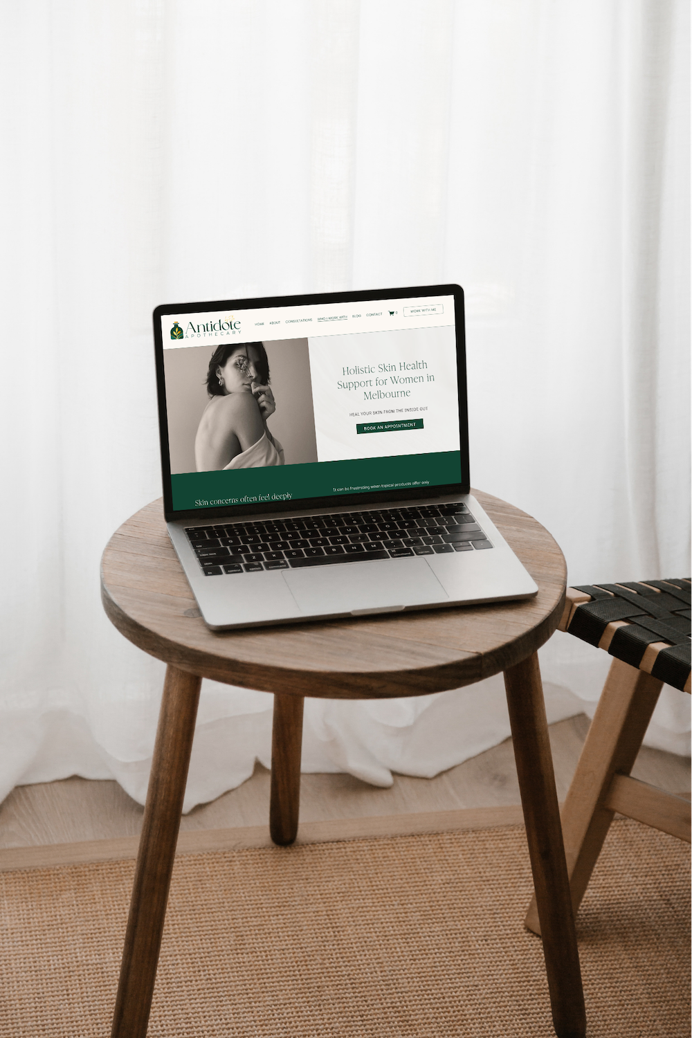
Section one: the above-the-fold statement
This is the first thing a visitor sees before they scroll. It is the most valuable real estate on your entire website.
It needs to answer four questions immediately:
Who are you
What do you do
Who do you do it for
Where you are based or whether you work online
The goal is not to impress. The goal is to orient. Within two to three seconds, the right person should know they are in the right place and the wrong person should self-select out. Both outcomes are correct.
A common mistake is leading with a tagline that is poetic but unclear. Save the poetry for further down the page. Above the fold, clarity wins every time.
Section two: how to work with you
Immediately after the introduction, before you talk about your philosophy or your story or your qualifications, show visitors how they can work with you.
This means your services, your packages, your programs — whatever the entry points into your business actually are. Three or four options laid out clearly, with a brief description of each and a link through to the relevant page.
This section answers the question every visitor is subconsciously asking: is there something here for me?
It also does something structural that matters for SEO. Those internal links — from the homepage through to individual service pages — tell Google that the content across your site is interconnected and relevant. Combined with visitors clicking through rather than bouncing straight back out, this signals that your homepage is delivering what it promises.
Section three: the transformation or pain point section
This is where you speak directly to what brought the person to your website in the first place.
Not a list of your features. Not a paragraph about your methodology. A direct acknowledgment of where they are now — the frustration, the exhaustion, the thing that is not working — and a clear indication of where working with you can take them.
This section is what makes a potential client feel seen. And feeling seen is what makes them keep reading.
For health and wellness practitioners in particular, this section carries significant weight. The people landing on your website are often carrying something difficult. They have usually tried other things. They are not just shopping around — they are looking for someone who understands what they are dealing with. This is where you demonstrate that you do.
Section four: a brief introduction to you
Notice where this sits. Not at the top. Not second. Four.
This is counterintuitive for most business owners because the website feels like it is about them. But for a potential client, the website is about them — and they need to know what is available and whether they are understood before they are ready to invest attention in who you are.
By section four, they are engaged. Now a brief, human introduction earns its place.
The operative word is brief. A few sentences. A photo. A link through to your full About page. The goal of this section is not to tell your whole story — it is to create enough of a connection that they want to read the full story on the next page.
Section five: trust signals and a next step
The bottom section of the homepage is where you consolidate the case you have been making throughout the page.
This typically includes testimonials or social proof, any relevant credentials or media appearances, and a clear call to action — usually a prompt to book a discovery call, enquire, or take whatever the most appropriate next step is for your business.
The testimonials here should not just be positive. They should be specific. A testimonial that says the experience was wonderful is less useful than one that describes a specific problem, what changed, and what that change meant for the person's life or business.
A note on what does not belong on the homepage
The homepage is not the place for your full story. It is not the place for a complete service description. It is not a blog, a case study, or a portfolio.
Every element on the homepage should either orient the visitor, build trust, or move them toward the next step. If something does not do at least one of those three things, it does not belong on the homepage — it belongs on a dedicated page the homepage can link to.
This is also why multi-page websites outperform single-page websites for service businesses. A homepage that tries to contain everything ends up overwhelming visitors. A homepage that is structured to guide visitors into the rest of the site gives them a journey.
"On the average web page, users have time to read at most 28 percent of the words during an average visit. 20 percent is more likely."
— Nielsen Norman Group, research on reading patterns online
How to audit your current homepage
Read through your homepage with these questions:
Does the first thing a visitor sees tell them what you do, who it is for, and how to reach you?
Can someone find out how to work with you without scrolling more than once?
Is there a section that speaks directly to where your ideal client is before they find you?
Does your personal introduction come after the visitor has already been given a reason to care?
Is there a specific, clear next step at the bottom of the page?
If the answer to any of those is no, that is where the gap is. And it is almost always a structural gap before it is a design gap.